Mary Rose Cook's notebook
The public parts of my notebook.
Prototyping tools
Bas Ording, Macromedia Director
Designed the inertial scrolling on the iPhone.
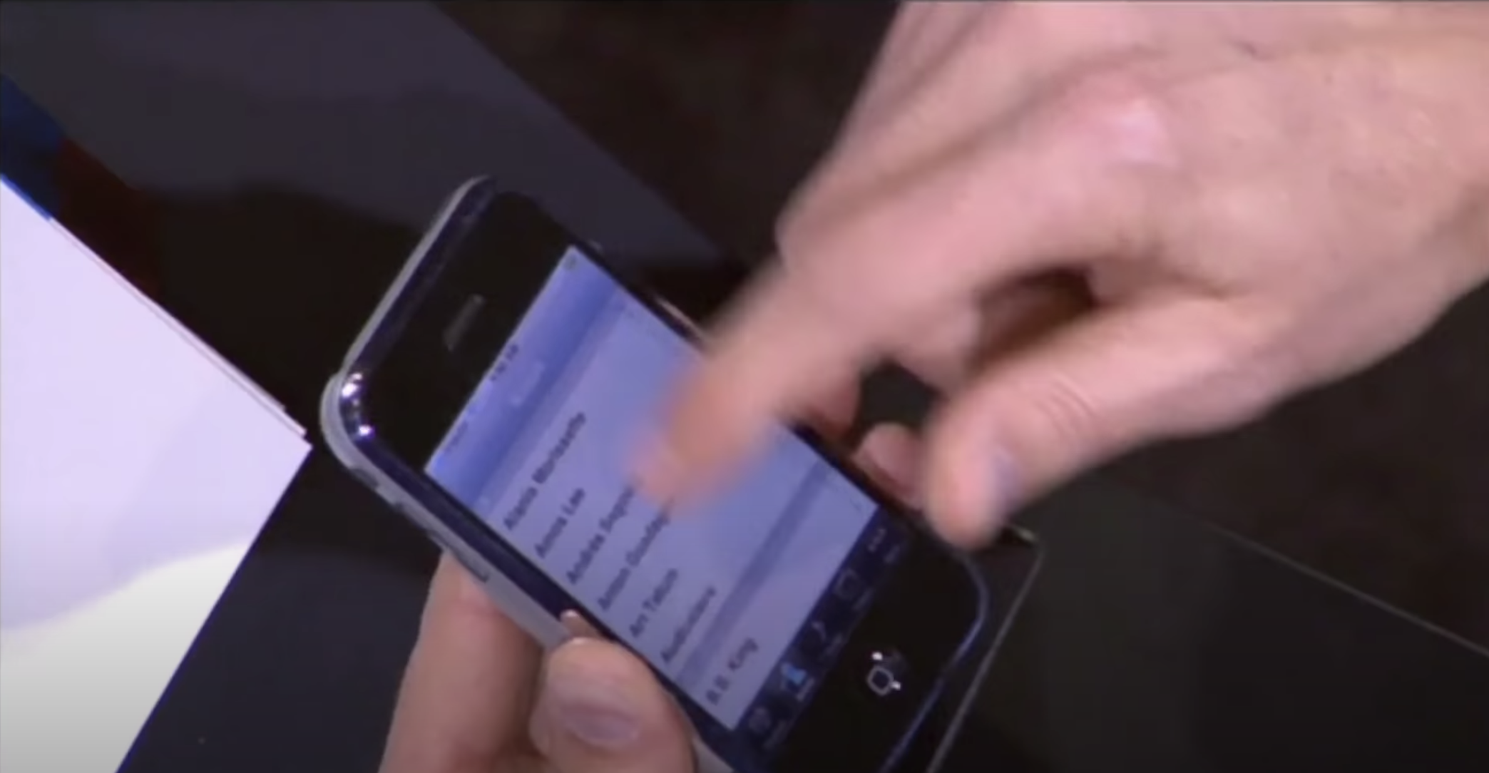
Steve Jobs demoing inertial scrolling at the introduction of the iPhone:

Jobs talking about the design process at at the All Things D conference:
They called me in and showed me this prototype display. And I gave it to one of our other really brilliant UI folks, and he called me back end he had inertial scrolling working. When I saw the rubber band inertial scrolling and a few other things, I thought, "My God, we can build a phone with this."
John Markoff interviewing iPhone team members Hugo Fiennes, Nitin Ganatra and Scott Herz:
Markoff: So, it seems totally obvious and nobody notices it at all, but when you're browsing and you reach the bottom of the page, it bounces. Is that an idea, and where did it come from?
Scott Herz: That's mister Bas.
Ken Kocienda, Creative Selection, on Bas Ording's design of the iPad keyboard in Director:
He’d built a demo using Adobe Director, a software package that, even back then in 2009, was a leftover from a bygone era of computing. Multimedia authors used Director extensively in the 1990s to create content both for distribution on CD-ROMs and for the interactive kiosks you might have found in a shopping mall to help you locate a shoe store or the food court. Flash, the web, and mobile computing had made Director obsolete, but Bas still preferred it, mostly because he was a whiz with the Lingo programming language integrated into the software. This allowed him to create fully interactive demos that superficially looked and behaved like a Mac or an iPhone, even though they were just pictures and animations woven together with a little Lingo code. Even though his demos weren’t “real” software we could ship to customers, Director enabled Bas to make quick prototypes that provided a good sense of how the real thing would work.
I looked over Bas’s shoulder as he started up his latest Director creation. On the screen of his Mac, I saw what looked like a stretched-out iPhone keyboard. The background, keycap, and key letter colors were the same, but the overall shape of the layout was considerably wider than it was tall. Bas told me this was his proposed design for the iPad keyboard. He’d made this demo to test some variations. “Around the edges of his keyboard, Bas had a set of onscreen controls, and as he started to press the buttons and move the sliders, the background, keycap, and key letters on his demo keyboard changed. He made the keycap font bigger and smaller. He switched between light letters on dark keys and dark letters on light keys. He altered the dimensions of the space bar, delete key, and return key, and as they grew or shrank, the other keys changed shape to fill the gaps. Each option was accompanied by a carefully crafted animation that highlighted what was changing.
And on the design of inertial scrolling and the iPhone Springboard:
During my visit to the HI studio to get my first look at multitouch, Bas Ording took me through an interactive demo he had made, as always, in Adobe Director. On his desk, he had a device we called a Wallaby, and this phone-sized “experimental device was how Bas developed and tested his touchscreen demo. Prototype hardware met prototype software on the Wallaby, a multitouch display designed to give an approximation of the correct form factor of our smartphone and provide the right feel in your grip as you touched the screen. The Wallaby was tethered to a Mac through a supplementary hardware board and an umbilical cable about a quarter-inch thick. The Wallaby was only a screen. The Mac supplied the computing power, and various other connectors ran here and there. All this gear provided the hardware support to make the prototype software come alive. Bas picked up the Wallaby display, and as he tapped and swiped, he showed me the rudiments of an Apple-style touchscreen user interface system, including an intuitive, row-and-column home screen icon launcher program called SpringBoard and a fluid inertial scrolling scheme that bounced playfully when he reached the end of a list.
Mike Matas, Quartz Composer
Matas made Lobe, Facebook Paper, Our Choice (Al Gore's interactive book about climate change), and parts of the UI of the iPhone.
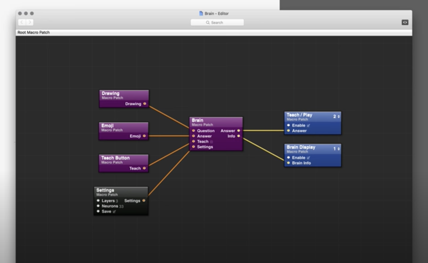
He made a working demo of Lobe, his accessible machine learning model builder, in Quartz Composer.

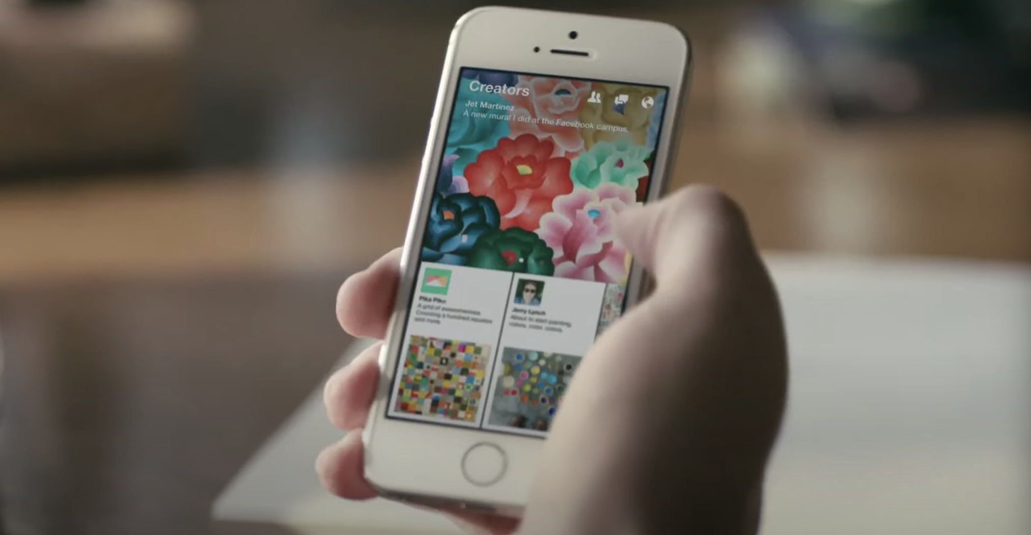
And he prototyped features of Facebook Paper in a Origami, built on top of Quartz Composer:
One of these tools is Origami. Based on an Apple graphics tool called Quartz composer, Origami is really just a way of building images. It lets Matas and other designers fashion prototypes by piecing together hundreds of tiny graphical widgets and animations. But these images can behave like complete applications. They can even tap into live data generated by smartphones, drawing on, say, the gyroscope that tracks how a phone is moving.
For Matas and others on the team, the tool feeds the creative process in a way other prototyping tools do not. It's not just that designers can build remarkably complex prototypes. They can also remake these prototypes on the fly. "You're able to see exactly what you're doing as you're building stuff," Matas says, 'It's like you can play and hear at the same time. You can create a feedback loop where you're able to improvise and come up with ideas on the spot.'
In the past, he says, if you really wanted to see how an idea would work, you had to actually build an application with software code – or get someone to code it for you. This isn't always ideal, especially for non-coders like Matas. "With your typical programming language, you have to type in a bunch of code and hit 'compile,' and a minute later, you see what you built," he says. "It's almost like you're trying to learn how to play the piano and you have a piano where you hit a couple of keys and then hit a compile button and a minute later you hear what you played."

And here is Wil Shipley talking about how Matas used Quartz Composer to develop UIs based on Newtonian physics:
But that really excites me because I think the physics-based is where we're going for all UI interactions. That's actually the story of why Matas has left Apple actually, is he was working on iPhoto, the one for the iPad. This is so funny because he's a high school dropout, and he's like, "Whatever. You can't teach me anything. I can't learn myself." He really could. Then he realizes very quickly that physics, like classes he decided to skip, contains the key to realistic-feeling interfaces. He teaches himself all the Newtonian physics, and then he codes it all in Quartz Composer.
He has all these Quartz Composer patches that use real Newtonian physics, and he showed it to me. He's so proud. We were in an airport once. We ran into each other randomly, and he just sits me down and shows me this stuff on his Mac. He's like, "Look at this. See, I've got all this. Here's my gravity constant. Here's my direction constant. Here's all these different constants. I plug in these patches, and then all these objects I just imply an impulse to them. Then they just slow down naturally over time. If I flick this photo, watch how it slows down completely correctly."
I'm just like, "You're a high school dropout? I don't know anybody that graduated high school that could do this math." [laughs] Much less write a fucking Quartz Composer, which is probably the crazy part of it, a patch and Quartz Composer. Yeah. He did it. iPhoto is supposed to be entirely physics, but it's really hard to do actual physics or was hard to do actual physics for animation.
I don't know if Apple's announced anything on that, so I guess I'll shut my mouth. But it was hard. As of 10.8, it's hard to do actual physics in core animation. They give you three options, right? You can do linear. You can do a thing that slows down. You can do a thing that speeds up as it goes on its path. But you can't say, "Oh, here's my gravity context. Here's my..." all that.
But I really do think that is the key to the future. Yeah, so Matas has coded all that. He was all excited about it, and the programmer was like, "Yeah, it's really hard. I'm just going to use ease in, ease out." Matas is like, "You suck. I quit."
#notebook