Mary Rose Cook's notebook
The public parts of my notebook.
Design is One
A documentary about Lella and Massimo Vignelli. Mostly fawning interviews with colleagues and unenlightening interviews with the subjects about their working relationship. These moments stood out:
An examination of how Massimo chooses typefaces. “He thinks about it carefully, then chooses Helvetica.” He listed a few serif typefaces as worthwhile: Times New Roman, Garamond, Bodini. And a few sans serif typefaces: Helvetica, Futura.
The examples of him using a grid system for layout.
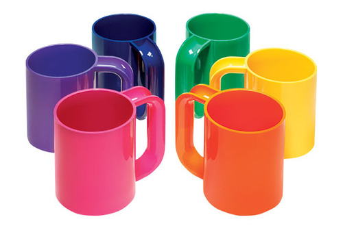
The cup and saucer he designed for Heller. Users complained about the original version, saying that the half-moon cut out for the U-shape of the handle let the contents spill out. The version in wide use had that hole plugged by a piece of plastic. See the picture below. Massimo complained that the complainers were unsophisticated: the cup was designed for drinking demi-tasse, and should not be filled to the brim.
#notebook #medianotes